
To support our strategic ambition to grow the community ownership movement in all parts of the UK, we are today launching a refreshed brand for Plunkett.
We are excited to introduce you to a new look for Plunkett UK, our new operational name.
The refreshed branding incorporates a suite of colours, an updated logo and a strapline which reaffirms our commitment to the sector we are so proud to be a part of.
We have selected a colour palette for Plunkett UK that is comprised of hues connected with the natural world. Our primary colour is a muted shade of green (Juniper) and we lead with this colour in all of our communications. Juniper is supported by six other colours (see below) that bring flexibility and variation to all our communications. Our priority will be to use the palette in the most accessible way, to help everyone to access the services of Plunkett UK.

In some cases, we will use a version of our logo in association with a refreshed strapline – ‘Supporting rural community-owned businesses’.
We chose this simple, four-word phrase to appear with the name of the charity, because it clearly and concisely states our fundamental mission and unique selling point.
Whilst rural remains the predominant focus of our work and connects to the charity’s mission and objectives, our services will remain available to all meaning that Plunkett UK will continue to work with urban communities too, where the needs arise.
Our Plunkett 2022 – 2026 strategy remains the central influence on our work, and our vision for resilient, thriving and inclusive rural communities across the UK remains unchanged.
It is our intention to use the refreshed brand as a way of reaffirming our commitment to partnership working across all four UK nations to empower community-owned businesses to create innovative, inclusive and impactful spaces which benefit local communities in England, Scotland, Wales and Northern Ireland.
As we launch the brand refresh, James Alcock, Chief Executive, says, “Plunkett is such a special organisation with a well-respected brand going back well over 100 years. So many people and communities have such deep affection for Plunkett which means we approached the refresh with some trepidation!
“However, we felt the time was right – not just to establish a new colour palette – but to find a way of representing the organisation more accurately in terms of what we do, where and why. The consultation we undertook demonstrated that many people who had benefited directly from our support only knew us for that one thing and didn’t appreciate the history behind the organisation. Many people didn’t realise the deep rootedness of the organisation in the co-operative movement and the social economy. They perhaps weren’t aware of the depth of business support we provide and to the breadth of business models throughout the UK. We found too that many weren’t aware of the relationships we have with governments, funders and policymakers to represent members.
“I’m immensely proud of all this work that Plunkett does today. I hope the new modern take on our brand reflects this, and the ambition and confidence we have to tackle rural inequities and to bring about the changes that make up innovative, impactful and inclusive rural communities. I also hope our members feel this refreshed look reflects their contribution to the movement and that they are proud to belong to it.”
We are grateful to brand agency PANDA, one of our recommended membership suppliers, for partnering us on the brand refresh.
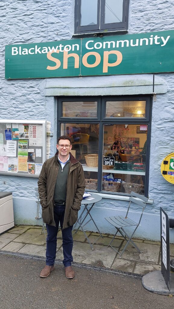
James Alcock, Plunkett UK’s CEO, visiting a community-owned shop in Devon last week
Join the movement: Become a member today
Why not join over 600 individuals, community businesses and corporate partners and become a member of Plunkett UK? Your membership, which for individuals’ costs just £20 per year, will support our ambition to grow the community ownership movement across the nation.


